If only you could see my face each day I walk in the office! After suffering for a year looking at a sad, mostly empty entry way for my PR, marketing and digital media biz, Seligman Brand Strategies, my begging to Target finally paid off! They connected me to Nate Berkus, a super talented interior designer I’ve admired for more than a decade since I first saw him on Oprah. All these years later, he’s still pretty easy on the eyes — and now has an insane (and, perk: ultra affordable) line with Target, among a million other accomplishments.
I’m honored he took the time to help our sad, pitiful space into a home we’re proud of clients, prospects and friends. I mean, I SHOWED NATE THESE BEFORE PHOTOS…
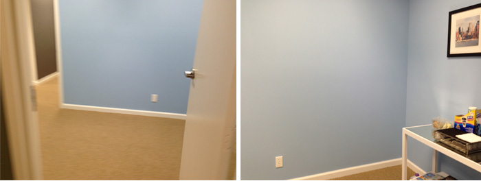
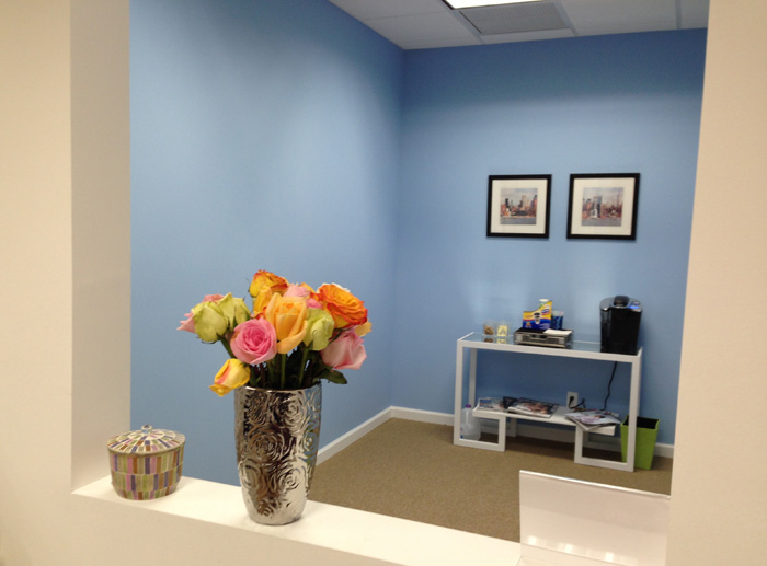
I spoke to Nate a few months ago {enter 14-year old girl screaming to One Direction-type sound here} and after I got past my super nerdy moment I just thoroughly enjoyed talking to him, hearing his honesty and smart approach to design that all us average girls can successfully integrate into our spaces.
And, ready for this?? Here is just one of the AFTER PHOTOS (much more after the jump!):
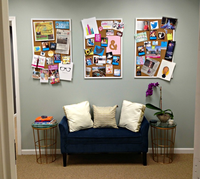
OK… now keep reading Nate’s wise words for this office as well as your spaces, to see the before and after pictures, and links to nearly everything you see here. Hate to encourage spending, but there are some major must-haves here, for office or your home.
… Heads up that I had questions but Nate instead asked asked if he could dive right in and share his feedback.
Yes, please!
Nate: My job is to tell you the truth; of course I have my ideas and changes but it has to be a space you can use. You have a really cute space, with the luxury of a comfortable waiting area {thanks, Nate!}. A space like this, just like a home entry, is the first impression a person will get of your space, in this case your company, and what it stands for. It’s a missed opportunity the way it is now.
The blue paint is too youthful, so I’d recommend a more sophisticated color to tone it down. The bold colors look like a kid’s bedroom or children’s playroom. People often make the mistake of going bright instead of layering in textures and original ideas that can better create mood, and provide a solid first impression.
Nate’s paint pick: My preference is Benjamin Moore’s Silver Marlin {2139-50), a beautiful sophisticated color that could work with your chair {heads up: the chair was lime green until the walls were painted. We were immediately obsessed with the wall color, and couldn’t handle looking at the ugly lime green. New slip cover ordered within three minutes).
HERE’S THE BEFORE, including the oh-so cool mirror I couldn’t even pick up off the floor for Nate!
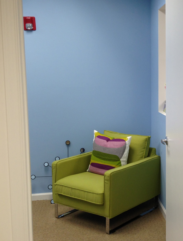
AND, THE AFTER…
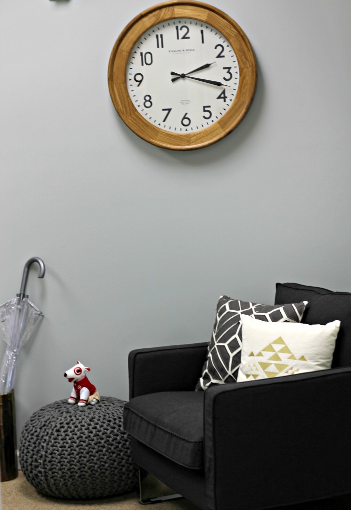
Amazing difference, right?? The paint color is soothing, and I love the integration of the greys. My girlfriend (and interior designer), Brianna, helped me pick out from Target a ton of the cute accessories you see around the place and was honestly instrumental in bringing this to life (picture someone walking in with bags of pillows bigger than her, for example, to test!); but accessories wise, this little ottoman is among my favorites. Perfect spot for Target’s mascot, Spot (yes, he sits there every day)!
After tackling the paint, Nate dived into specific parts of the office (thank goodness!).
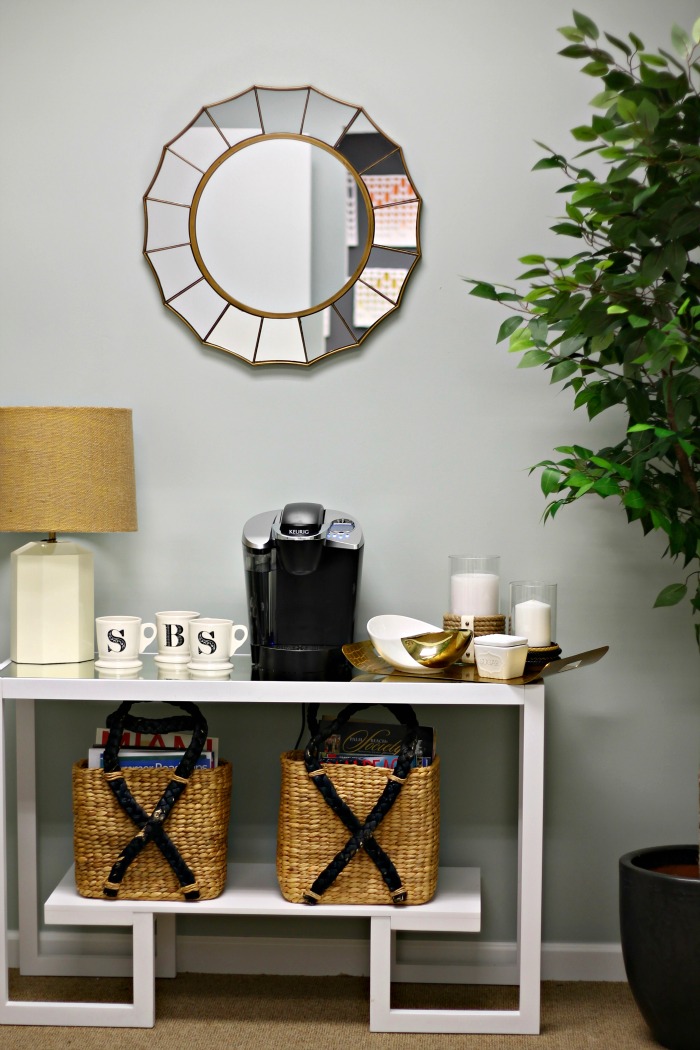
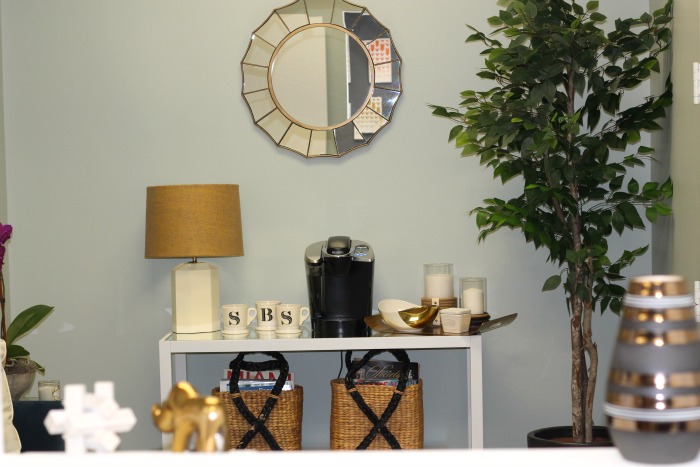
Nate: You can find a way to better accessorize your coffee table, and the area around it. Take down the small photos and instead hang a mirror. This is a really great console, so I’d add beautiful details to enhance it. Add hurricanes, a gold bowl, and a tray for cream and sugar. Place stacked cups on top, if you choose to use disposable. Place magazines in square baskets to help organize and corral them.
AGAIN, A PITIFUL LOOK AT THE BEFORE (container of disposable cups, included):
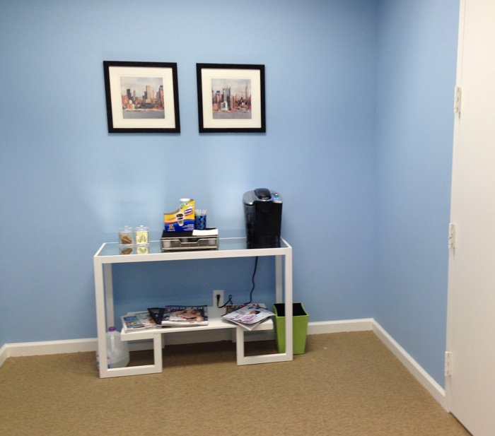
And, after Nate’s genius recommendations (and assistance by my girl, B; love the SBS mugs!!):
Next, Nate helped me tackle the wall/seating area right when you walk in… I knew it needed a narrow bench but was never sure how big, what size and what to put above it. Luckily Nate has all the answers:
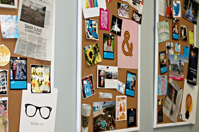
Nate: You have a large wall when you first walk in, so I understand why you’ve been hesitant to put anything there and what as a company is best. I have two ideas: Lowe’s has rollable cork so you can turn the wall into a giant inspiration board that represents the company. Put client work, anything that speaks to a client or potential client. It will be really interesting for people to see as they come in. Otherwise, consider taking a staff photo full of personality — lots of laughter and happiness — and hanging a huge black and white version on the wall (I liked option 1 better, but we got inspired by his second idea… ).
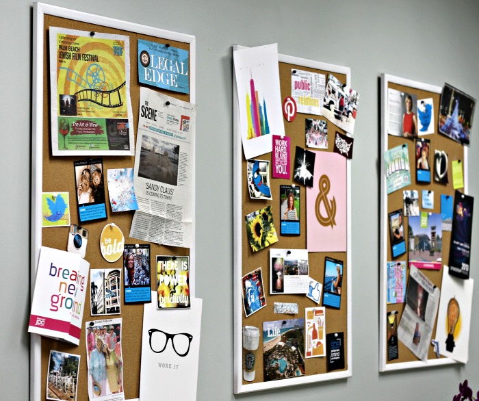
TAGG update: the rollable cork served as a huge challenge; it was so thin that it was ripping away from the nails in the walls (and hence, creating lots of holes in the wall!). Brianna suggesting buying regular bulletin boards and spray painting the frames white to frame the cork. LOVE! You’ll also notice there’s a few pictures with borders and blue boxes; each staff member found a fun photo of themselves, shared their loves (from Instagram to the beach) and our graphic designer mocked up these cool pictures we displayed around. I love how it shares a sense of who we are.
Nate: for the bench, the key is to layer. The bench doesn’t need a cushion, just find something clean and simple. Pillows are the story and provide the function of more space.
TAGG: Now, this is the first view you see when you walk inside (instead of the first picture at the top of the post).
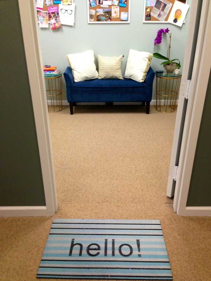
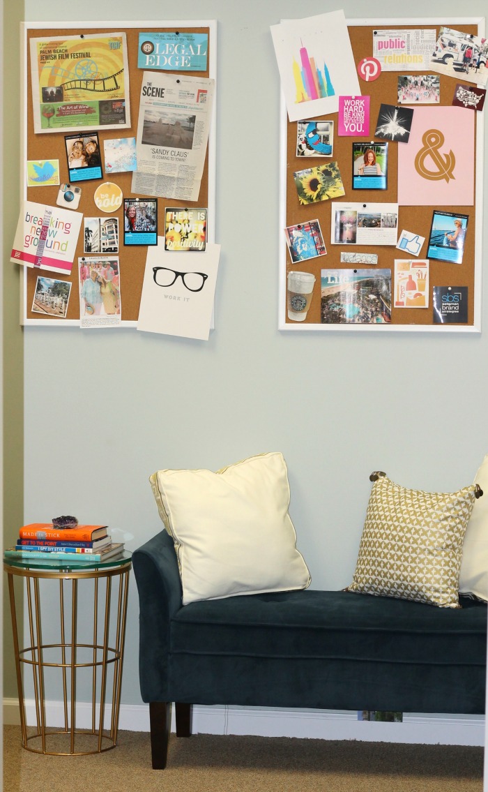
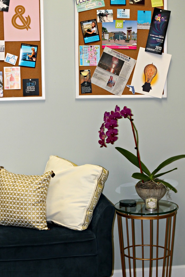
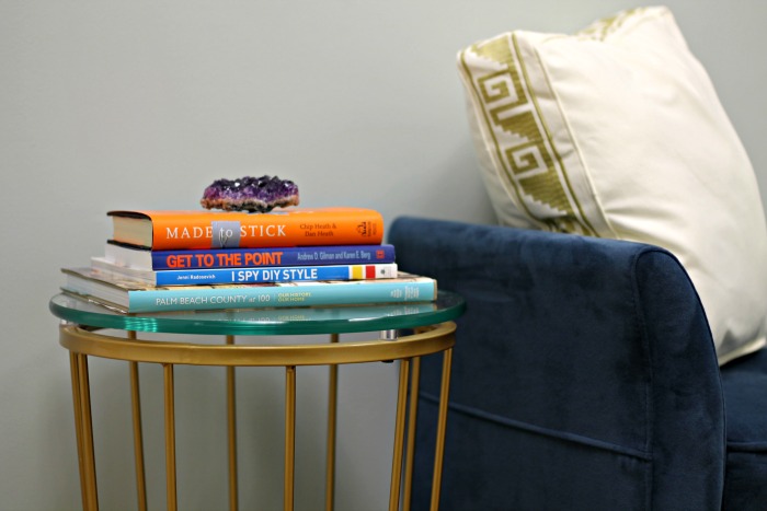
TAGG update: There is one area, if I’m being honest, where Nate and I disagreed after-the-fact, and I’m so happy: this blue bench. I’m smitten. You should know I’ve been dying for a blue couch in my living room for a year so when Brianna and I saw this it was like BAM, we need to make this work. It adds the perfect pop of color against Nate’s serene and neutral concept, and hey, it makes me smile… shouldn’t your space do that? {you understand, right Nate?}
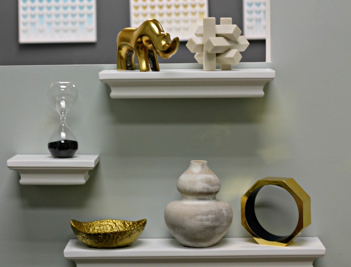
Nate: on the left side when you walk in, I notice the opening that leads to Heather’s office. Add another console or floating shelf underneath, with decorative gold vase or details. Consider very neutral, white drapes if you want to close off the space.
WHEH! Well, that’s my space! Incredible transformation, right? Everyone loves it, and I like best that as a small business owner, it was… affordable, yet still totally cool. Decorating comes further down on the list of financial priorities, unfortunately, so speaking truthfully, I love that Target had everything I wanted, or didn’t even realize I wanted. It’s such a great space now.
OK, enough about my office… ready to get down and dirty and hear some tips Nate was kind of enough to share that applies to all us TAGG readers?
Nate: when shopping, get creative in the aisles that you shop. Look in bedding for fantastic pillows even if you are looking for your family room. Office aisles could lead to great organizational pieces even if it’s for another space.
Look for textures, textiles, metallics and slightly neutral pieces, and find beautiful containers for everything. Put anything that can in a container.
The point of effective and well-designed space is that everywhere your eye lands should be beautiful to you. Office is not the place to let that go. It doesn’t have to look like a traditional idea of an office, and you don’t need to go to an office store; pieces can work in a home or an office.
So, Nate… TAGG is head-over-heels for your line, but fess up: how involved are you?
Nate: I’m a double virgo; I’m in every step of the process. I meet in Minnesota with the Target team and we’re constantly connected.
TAGG: We believe you; the line just feels like you, and the way we’ve learned your taste since your career started. We appreciate how your entire collection, from bed to bath and lifestyle go together, but aren’t matchy-matchy so as you say (we remember this from Oprah years ago), that your space looks collected over time… even if you did it all in one weekend!
Last one: what’s your favorite part of your office?
Nate: I finally broke down and did a wall that highlights my entire career — 15 years of work — in white frames with white mattes that is essentially floor to ceiling memories. I love walking past it, and I can remember, reference all of the memories from these experience, the media coverage, everything.

Links to everything available online:
lamp + shade
wicker basekets
mirror
keurig
mugs (anthropologie)
hurricanes (1, 2)
console table
tray
gold dipped bowl
accent tables
blue couch
beige pillow // gold pillow // heads up: all pillows here
Chair (IKEA) // grey geometric toss pillow // grey pouf
large wooden clock
umbrella stand (actually a vase) // clear umbrella
chevron artwork above desk
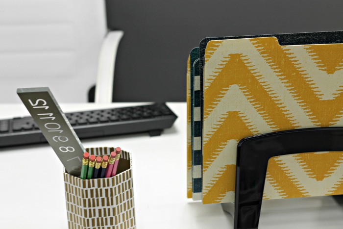
desk: file folders (latest version here; all gold!) // pencil cup
shelves: puzzle piece (possibly favorite piece!), oversized nut figural, gold pebbled bowl
art: ampersand; light bulb; work it (glasses pic)
Thanks again for your time, Nate! Sending you a friendly little wink and smile from our favorite Bullseye! We are so grateful you made our four (bright) walls more truly representative of we we are!
Disclosure: The Average Girl’s Guide is a member of Target’s Inner Circle, a small group of social influencers around the country. Target graciously connected us with Nate Berkus and provided us a gift card toward the update, however we contributed our own resources (and lots of time!), too. We couldn’t be more thrilled with the collection, quality and style. All opinions are 100 percent my own.











Pingback: PHOTOS: Nate Berkus Makes Dreams Come True Everywhere | | Olger Fallas Painting