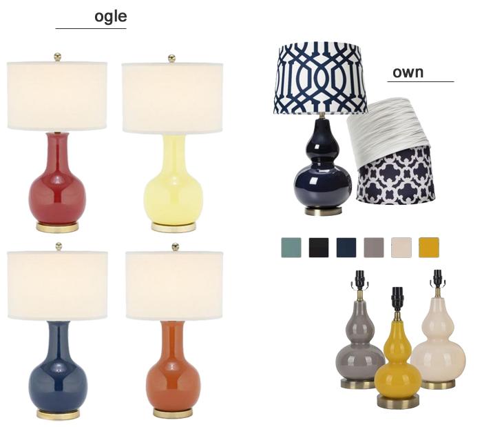
Truth be told, I’ve unnecessarily been eyeing the lamp on the left and pretty much the entire web site of Lulu & Georgia for an embarrassingly long time. They have such good home decor….the rugs, art, accessories, totally worth it — all feel original and special. Be careful: the site has become a time warp there’s so much home eye candy. That said, do I neeeeed to spend $400 right now on a set of lamps for our master bedroom? I have a lot of other spaces I’d like to invest in.
Enter, this own-worthy version. While the shape is not identical, it’s the closest match with the gold/bronze base detail and overall feel that I’ve found in a long time. The navy set with this white shade is in my cart, and feeling confident it will add the perfect color punch with our light grey walls, white duvet and orange x-benches for less than half the price of the version I’ve been ogling.

shop this style: ogle // own
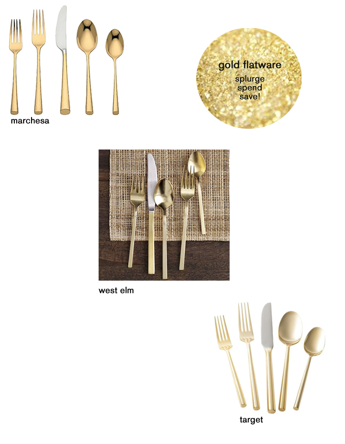
I was recently stopped in my tracks during a recent Target trip when I spotted this gold flatware. Swoon. It’s like the much-hyped West Elm version everyone went nuts about last season, yet more palatable to my wallet at $10 less per setting. Then, did you realize that Marchesa had a version at Bloomingdale’s? Gulp. At $90 per setting, I don’t think I could afford food to go with my gorgeous gold silverware!
We’ve been married 10 years this summer… so our silverware off our registry is approaching a decade as well! Thinking recently it might be time for a fun update. This gold silverware is a relatively inexpensive way to upgrade your day-to-day dining. Are you as big of a fan as I am?

marchesa flatware // west elm flatware // target flatware
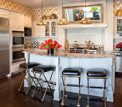
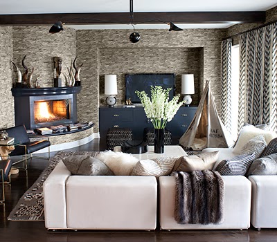
If you admit to watching KUWTK (Keeping Up With The Kardashians) like I do — it’s amusing tv, people! — then you’ve certainly taking a glimpse inside Kourtney’s gorgeous home. Obsessed. There’s a lot going on, and it might not be everyone’s taste, but it’s incredible inspiration, reminding me to pay attention to the details. I’m newly in love with learning more how to decorate my house so it feels like a home, and details like wallpaper, window treatments, lighting and more, really transform a place. Her home (now on the market) gives me a lot to think about. Dreaming I could just move in…

 Keep Reading —>>
If only you could see my face each day I walk in the office! After suffering for a year looking at a sad, mostly empty entry way for my PR, marketing and digital media biz, Seligman Brand Strategies, my begging to Target finally paid off! They connected me to Nate Berkus, a super talented interior designer I’ve admired for more than a decade since I first saw him on Oprah. All these years later, he’s still pretty easy on the eyes — and now has an insane (and, perk: ultra affordable) line with Target, among a million other accomplishments.
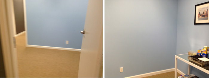
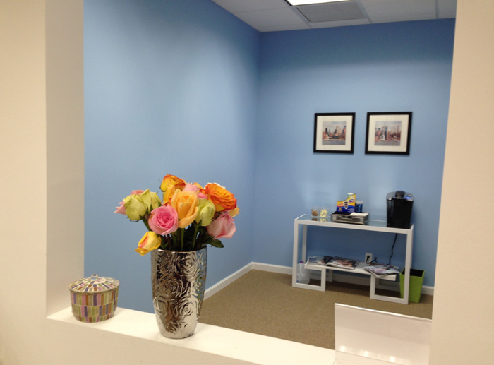
I’m honored he took the time to help our sad, pitiful space into a home we’re proud of clients, prospects and friends. I mean, I SHOWED NATE THESE BEFORE PHOTOS…


I spoke to Nate a few months ago {enter 14-year old girl screaming to One Direction-type sound here} and after I got past my super nerdy moment I just thoroughly enjoyed talking to him, hearing his honesty and smart approach to design that all us average girls can successfully integrate into our spaces.
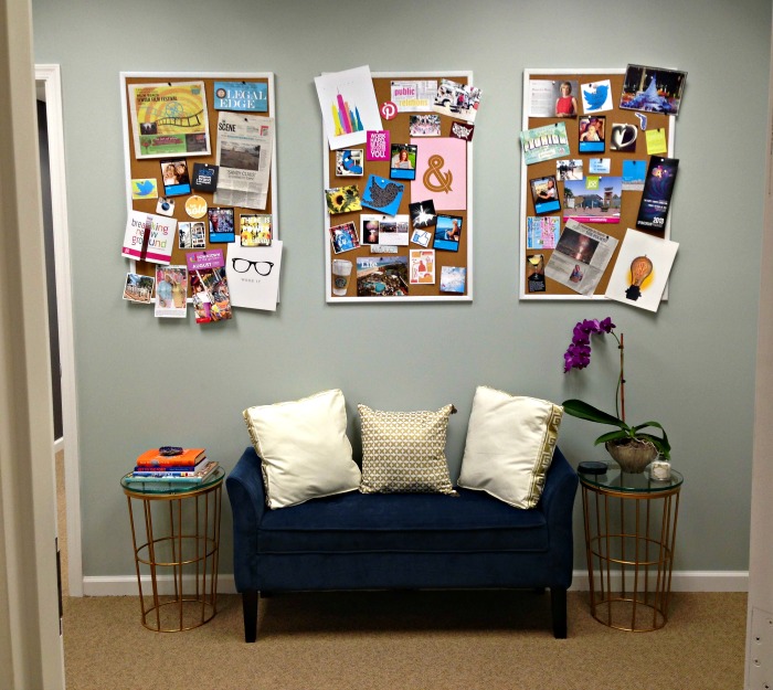
And, ready for this?? Here is just one of the AFTER PHOTOS (much more after the jump!):

OK… now keep reading Nate’s wise words for this office as well as your spaces, to see the before and after pictures, and links to nearly everything you see here. Hate to encourage spending, but there are some major must-haves here, for office or your home. Keep Reading —>>

